Masia Sabor
The Mediterranean, captured in every sip
Branding, design, communications & campaign creation
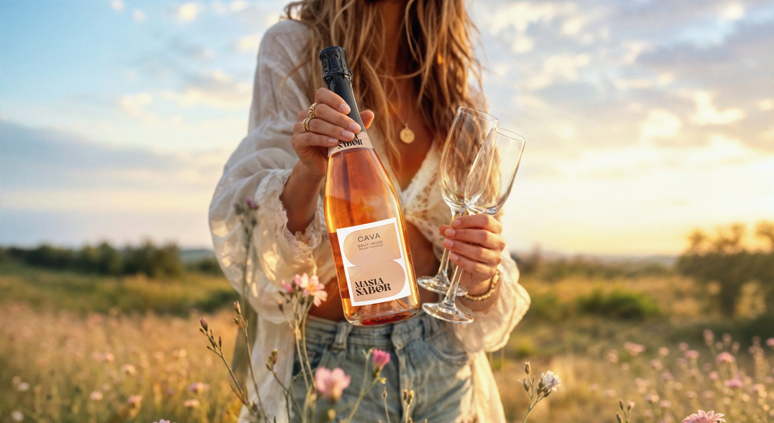
Masia Sabor is more than a high-quality cava for big celebrations. It’s a cava for moments you’d rather feel than fill. Its belief in authenticity and the power of rituals honoring the self called for a brand with the same calm and class. Guided by this strategy, Supermoon set out to create a new brand identity, along with a launch campaign to bring it to life.
A story of slow moments
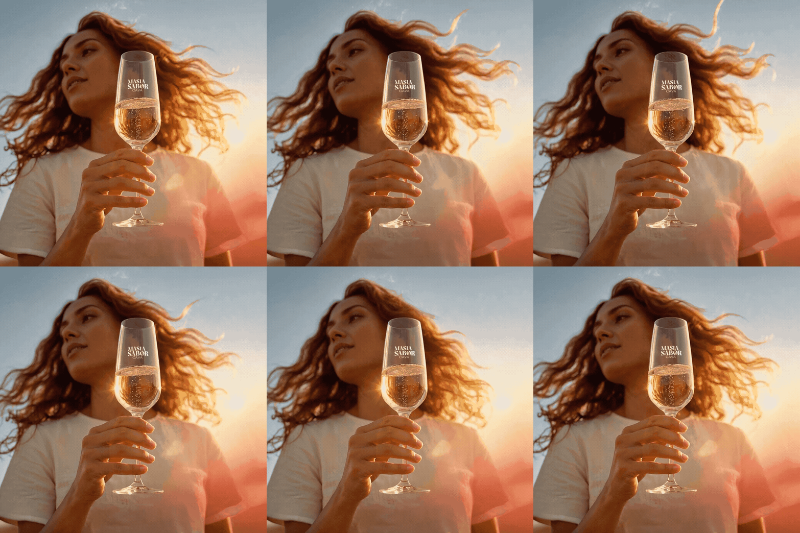
We built the brand narrative around Mediterranean life: the warmth of the region, the art of enjoyment and time well savoured. This philosophy comes to life with the tagline ‘Pause. Pour. Be Present.’ and a tone of voice that breathes rather than shouts.
Designing the collection
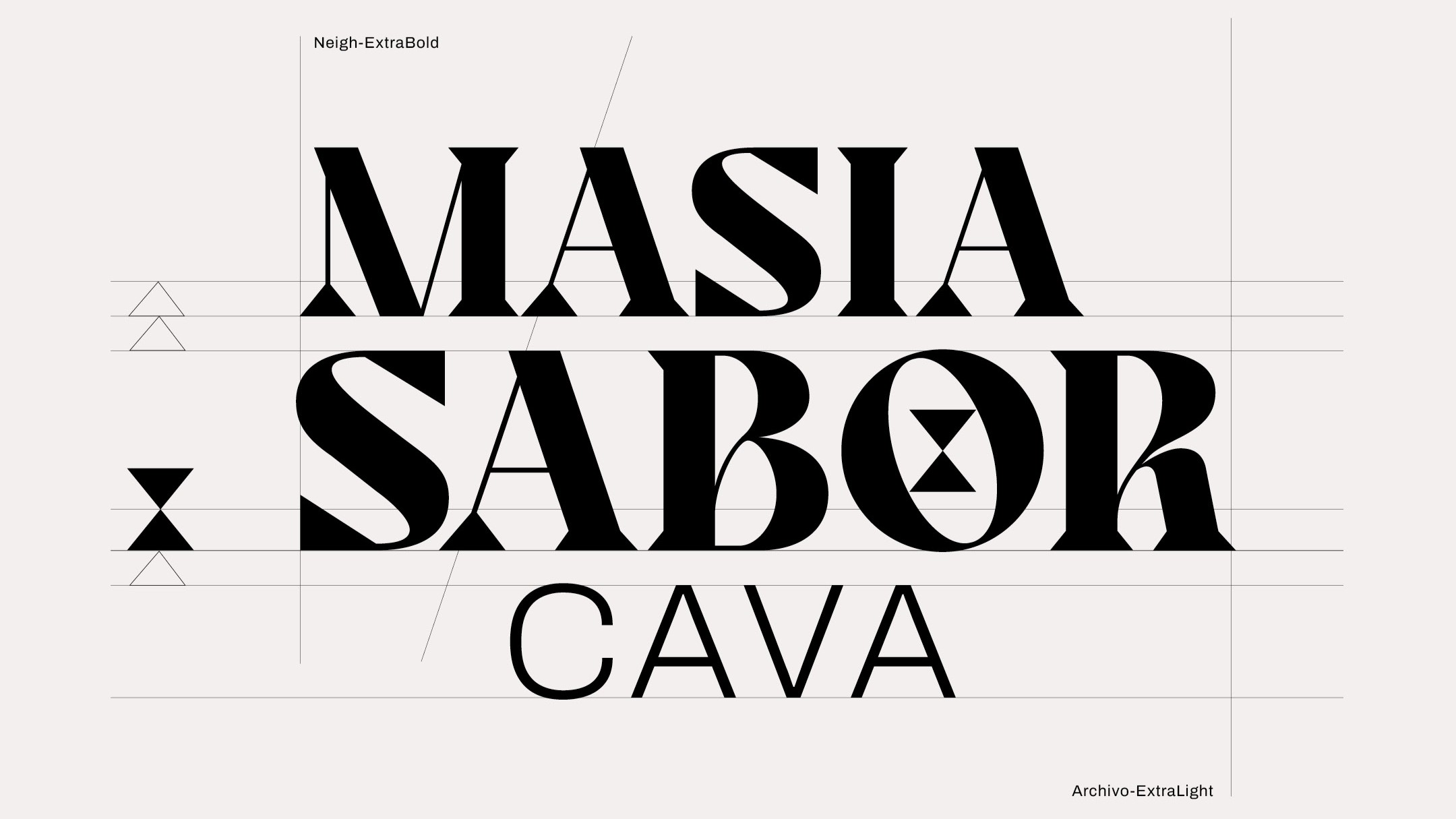
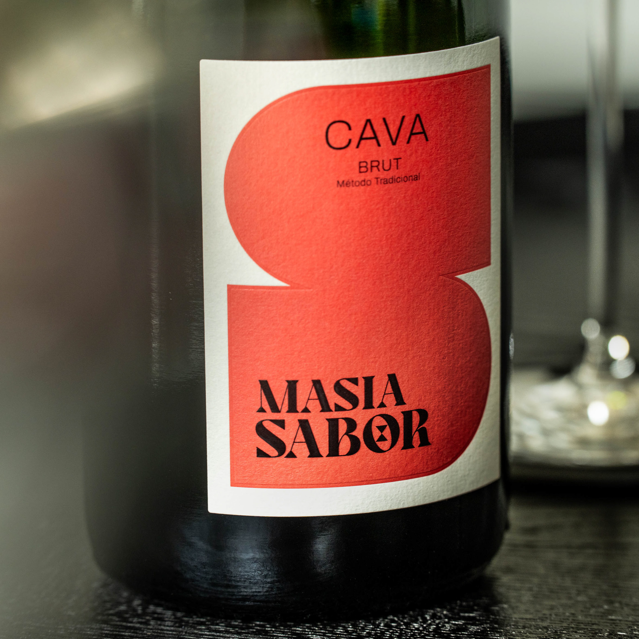
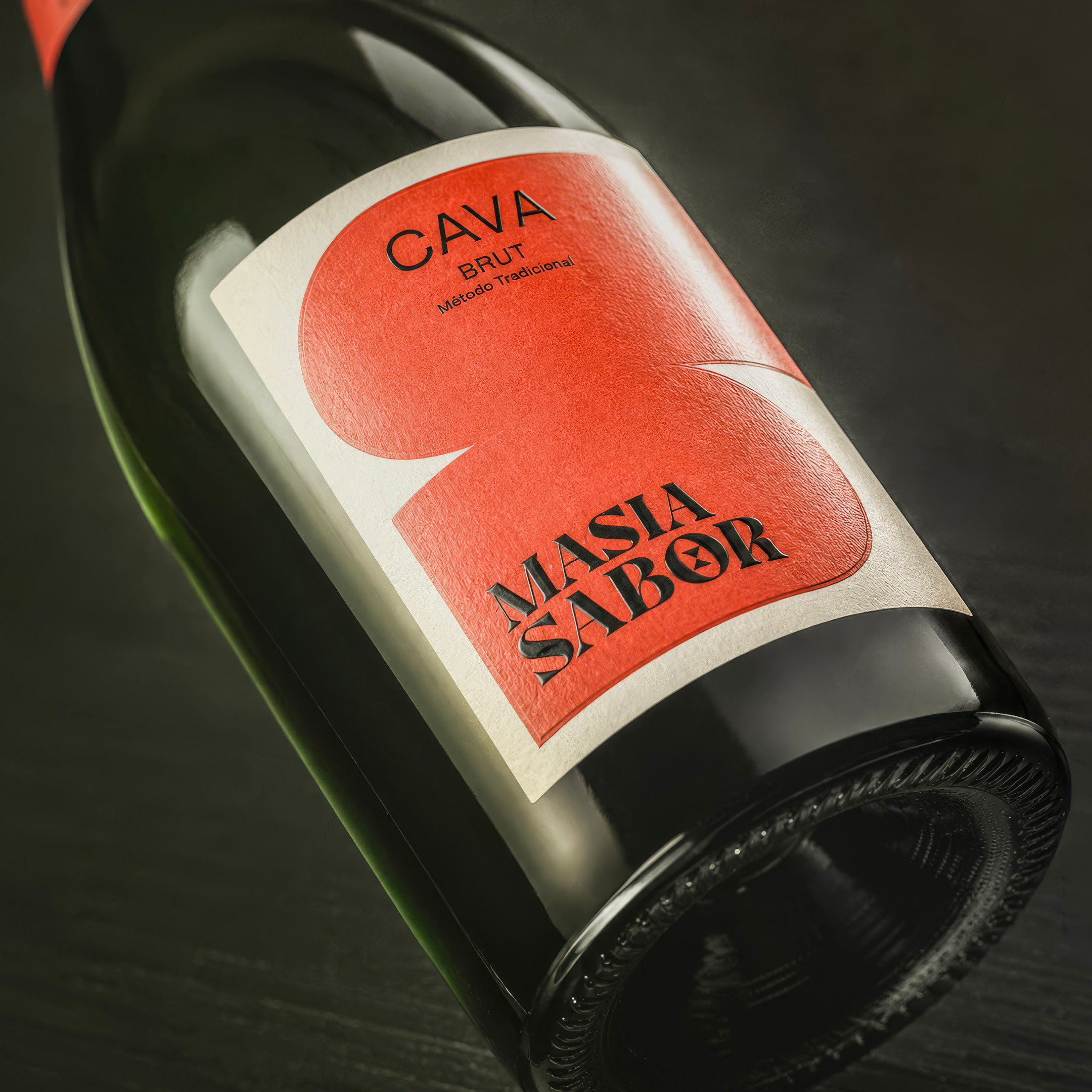
The identity took shape in a visual language for four different cavas, from Brut to Brut Rosé: a distinctive logo, a series of wine labels, typography, graphic elements, a coherent colour palette and imagery that capture the Mediterranean feel, carried through to all communication materials: from brochure to website, from instore communications to tailor-made tasting boxes.
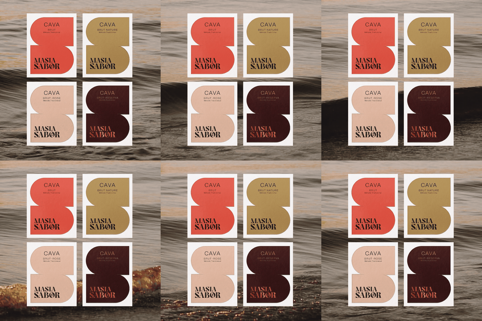
From grape to glass
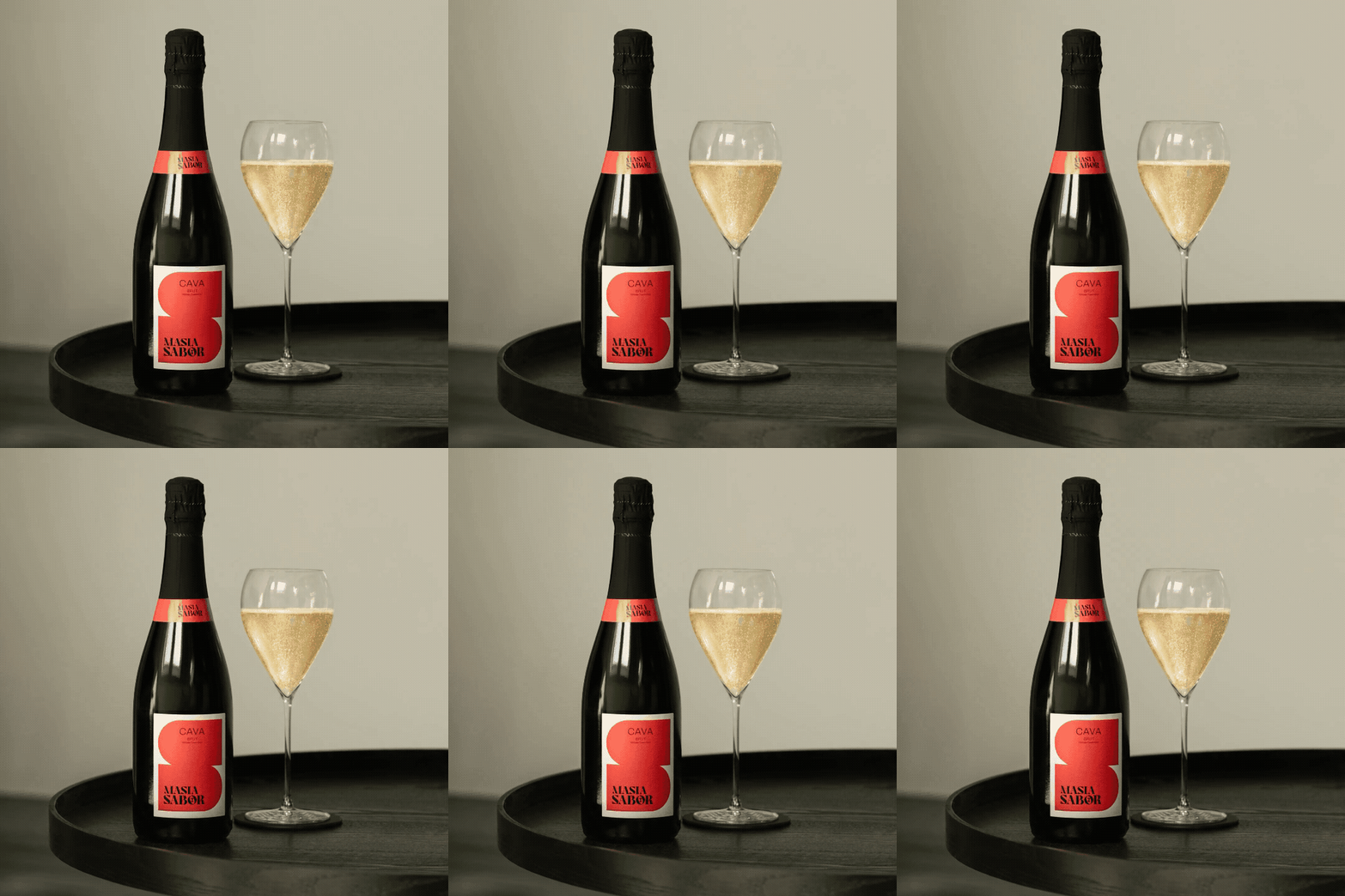
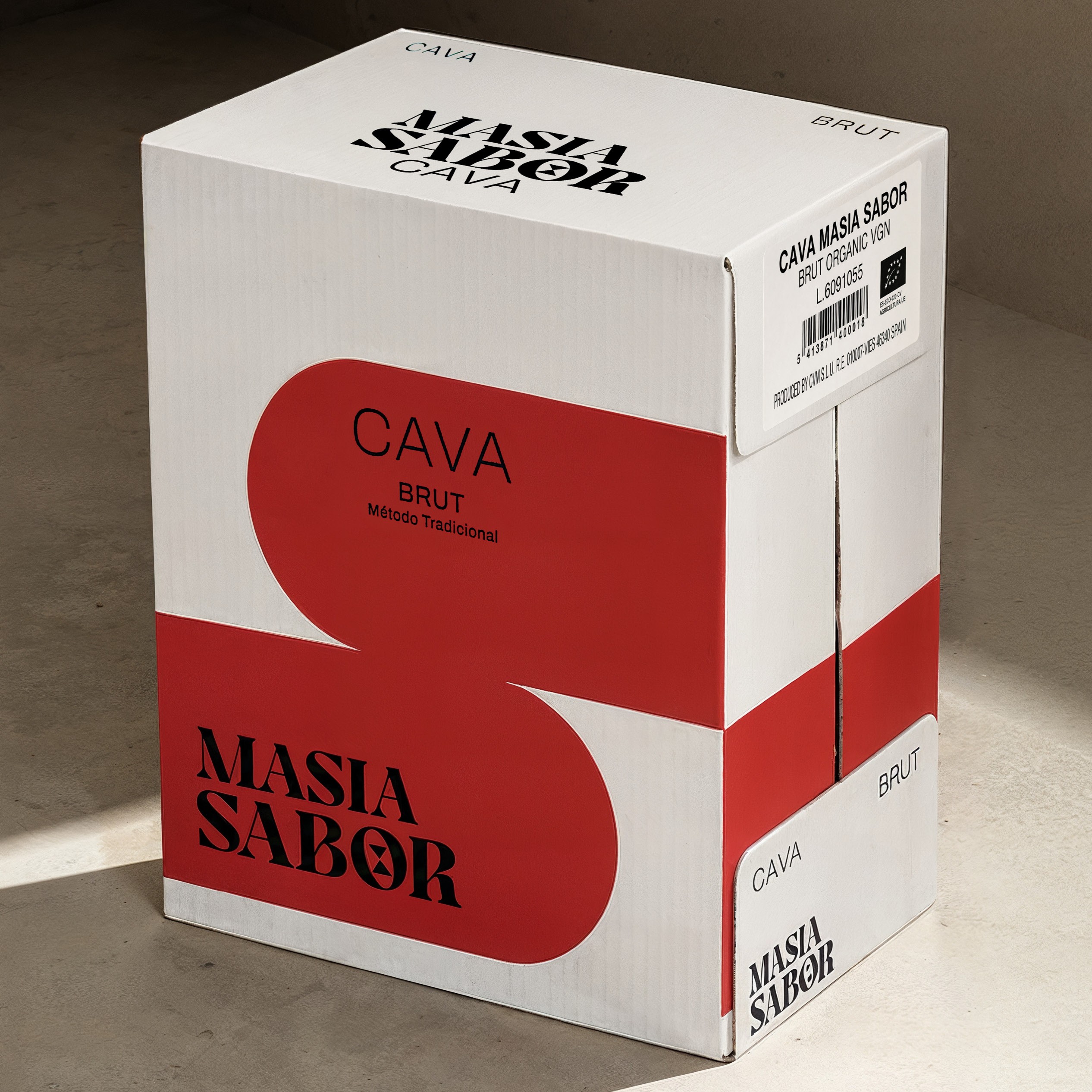
The identity is at its most tangible in the packaging. Supermoon designed the label and finish, as well as the outer cases the bottles are shipped in, right down to the branded glasses and ice buckets that put Masia Sabor on the table.