Sodexo – &merlin
A magical brand for bespoke event experiences
Branding, sales tools & visual content

From ambition to activation
To strengthen its position in the premium events segment, Sodexo developed a new concept in partnership with Huis van Dijck. Supermoon was invited to transform their plan into a compelling brand.

Strategy, naming and identity
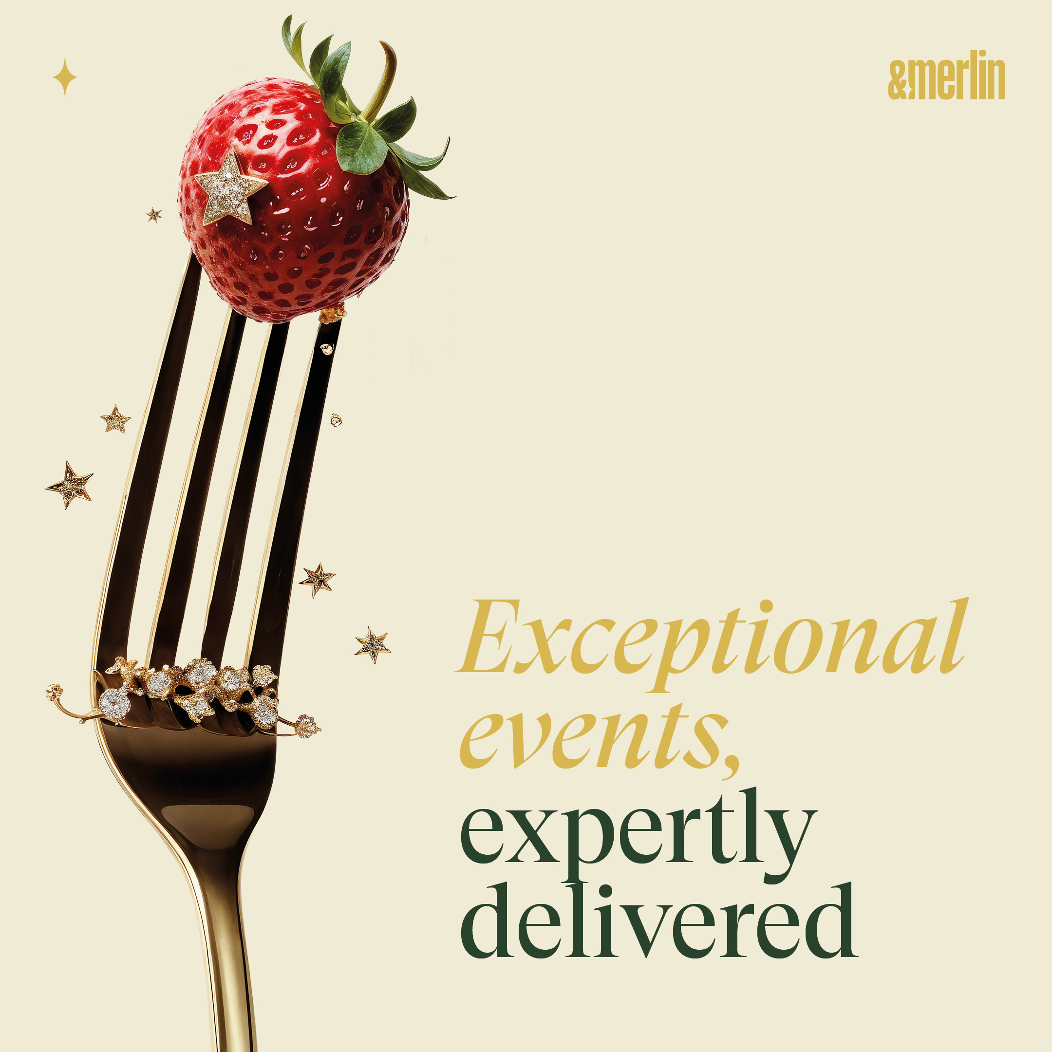
We began with a strategy and positioning exercise to define the brand’s values and direction. This led to the creation of the name “&merlin”—evoking a harmonious, client-centric approach, a “nothing is impossible” mindset, and the magical touch their event services provide.
Supermoon then developed the full visual and verbal identity: logo, colour palette, typography, tone of voice, and layout system—all compiled in a clear, comprehensive brand guide.


Ready to pitch
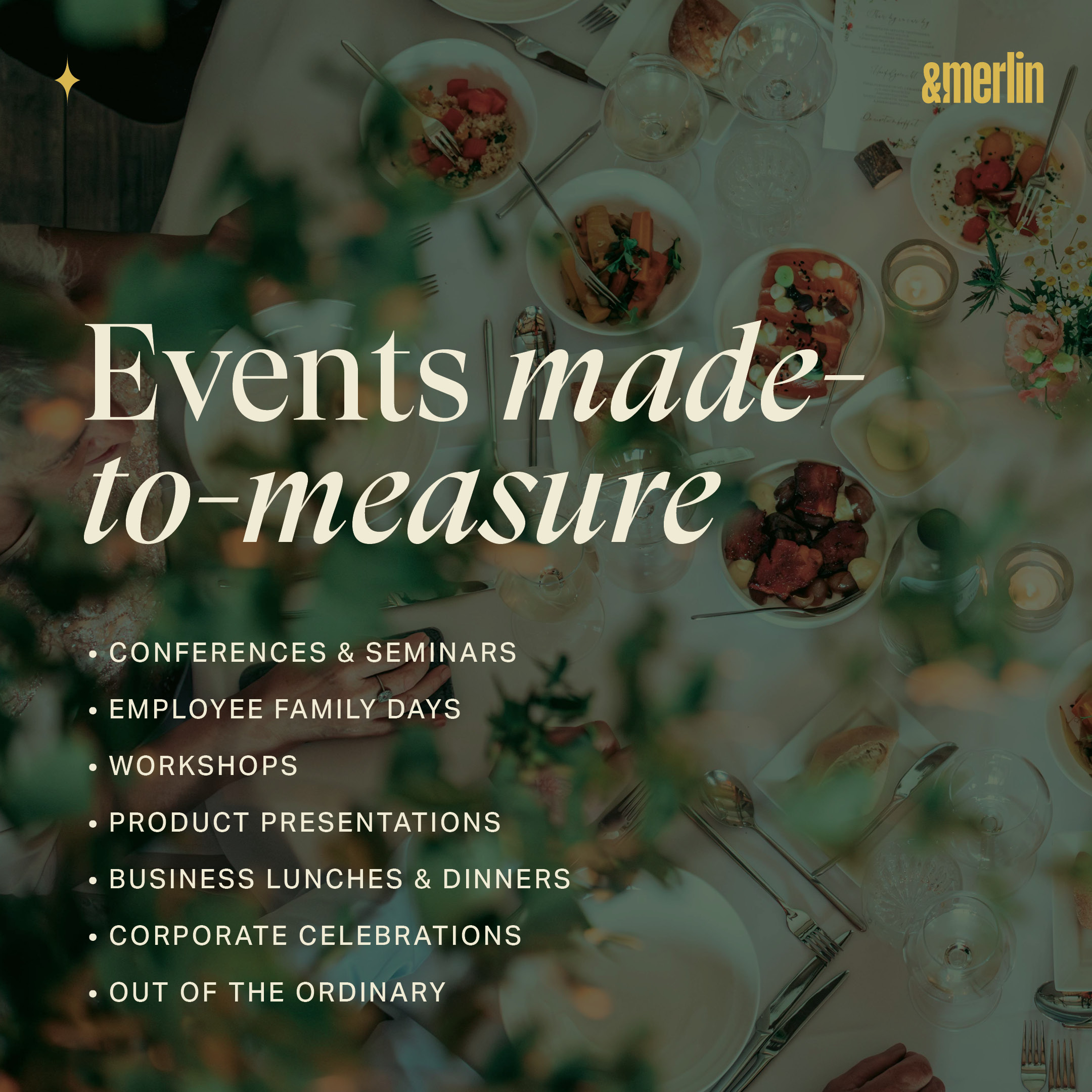
To support &merlin commercially, we designed a complete set of sales tools. From messaging to layout, every element is aligned to help the team communicate with confidence.
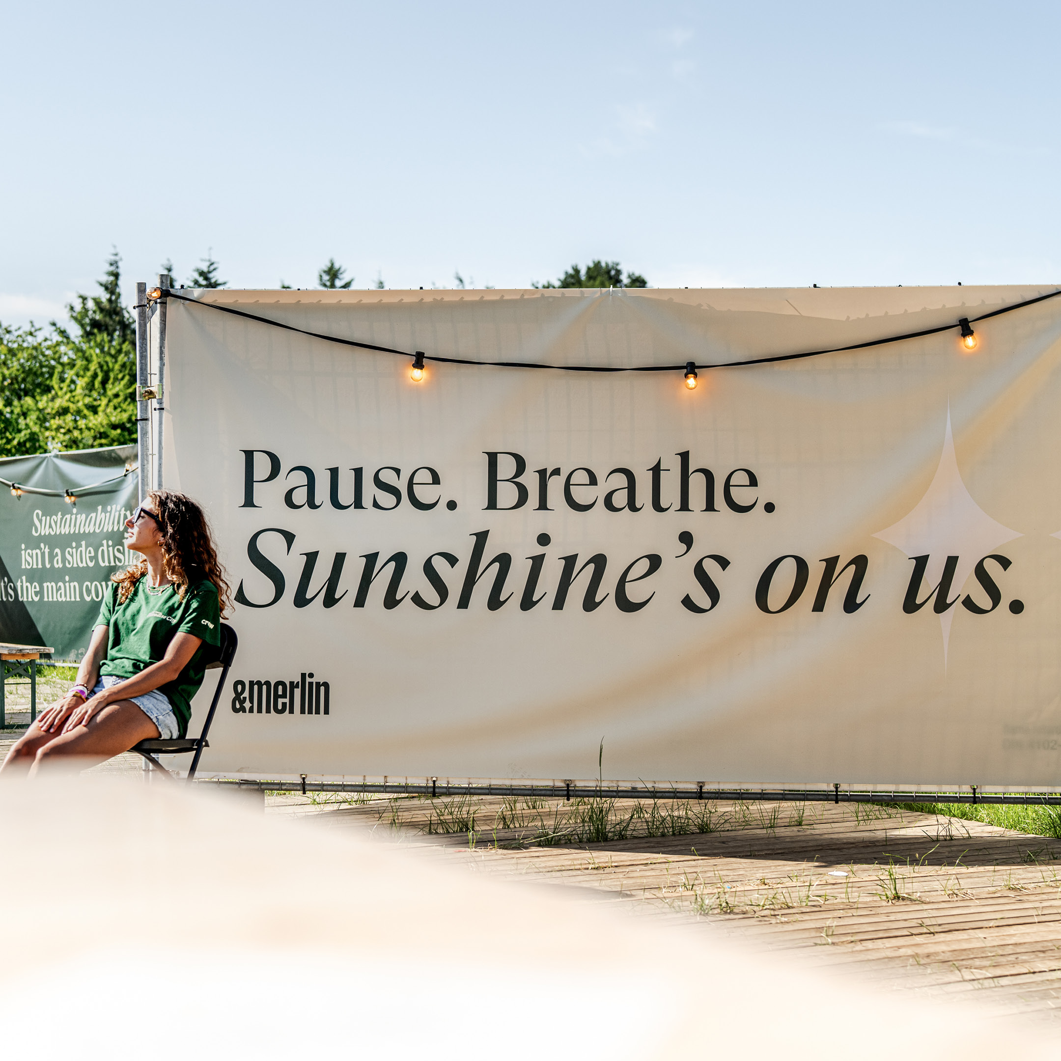
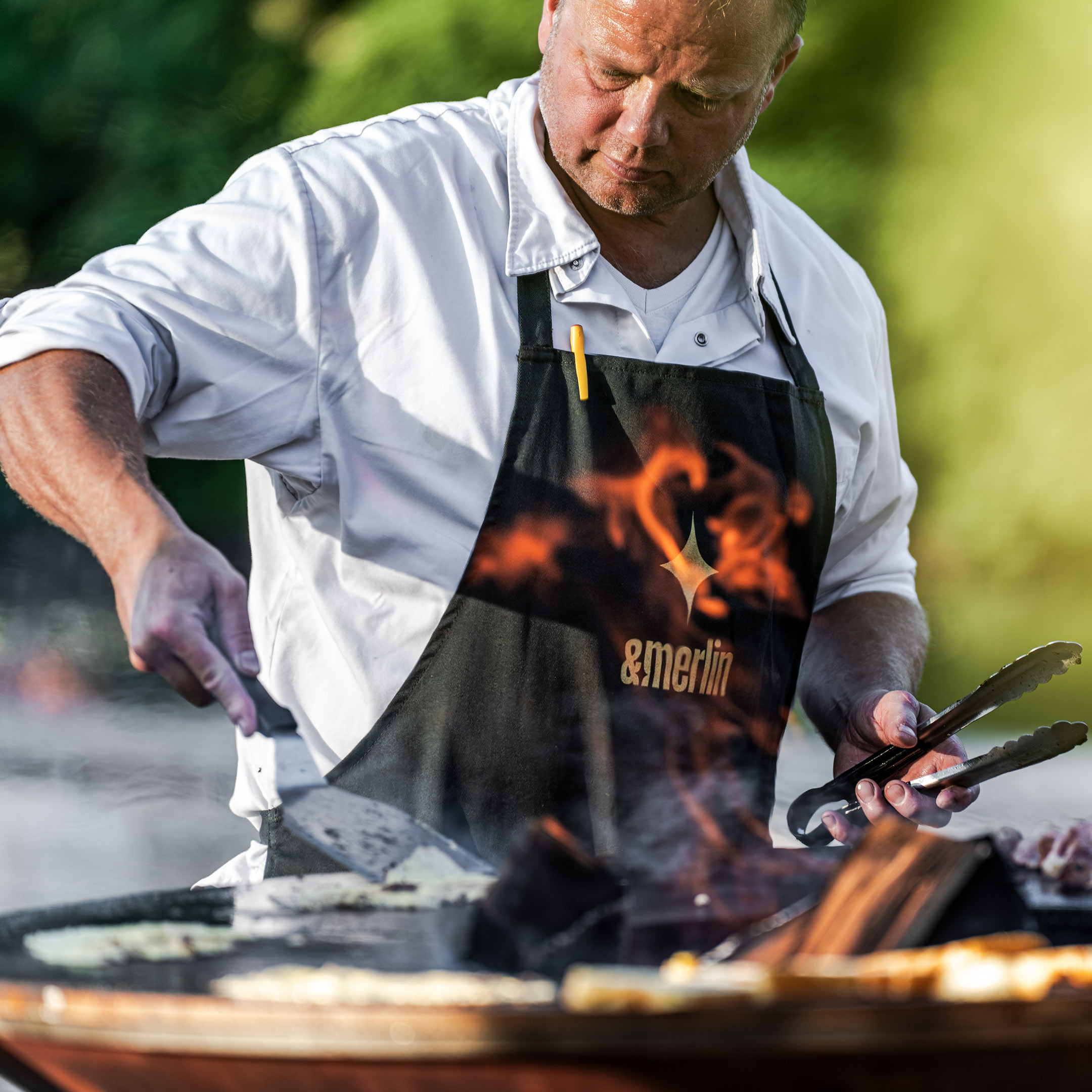
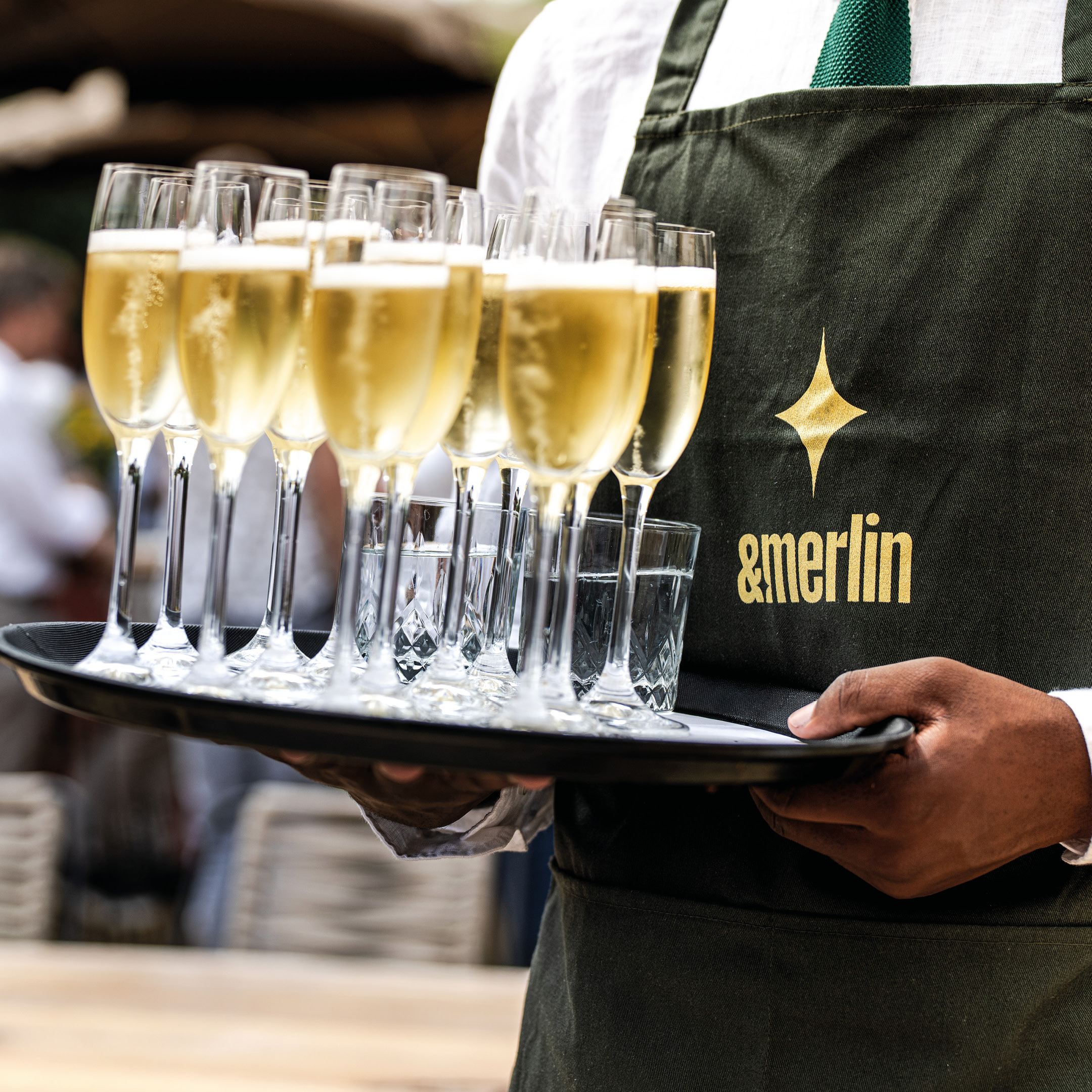
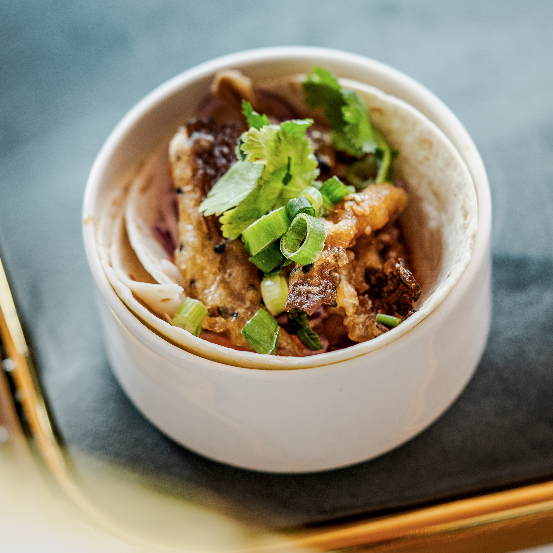
Bringing the brand to life
Finally, we completed the toolkit with a set of brand images, shot on location. These visuals capture the atmosphere, people, and details that define the &merlin experience.